NAME: ZON
DATE: 2009
Images courtesy: Frogdesign
CLIENT: ZON POrtugal
Role: Industrial design
FAITH: in production
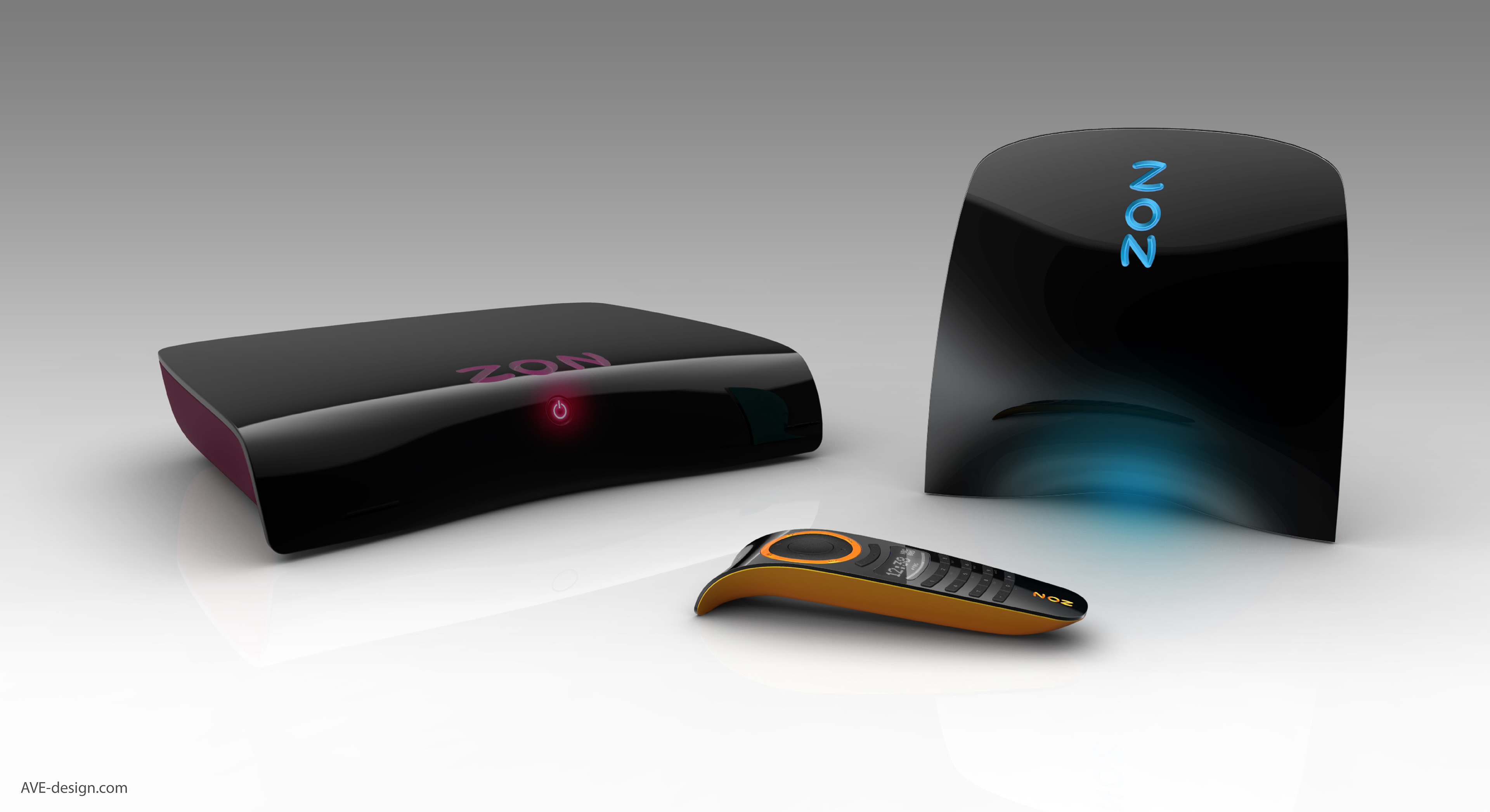
ZON, the Portuguese Cable provider needed an product design with a strong identity. Our goal was to generate a design language that would make the user feel like being part of the ZON family. Modern, fresh, energetic, strong and desirable.
As ZON was the new kid on the block it was the first to offer fibreoptic and the fastest Internet available.
The design created a lot of positive buzz and helped the new brand make it’s claims. ZON’s marketing team created completely new strategies after seeing this design to maximize the impact when launched on the Portuguese market.
The design created a lot of positive buzz and helped the new brand make it’s claims. ZON’s marketing team created completely new strategies after seeing this design to maximize the impact when launched on the Portuguese market.
Statement
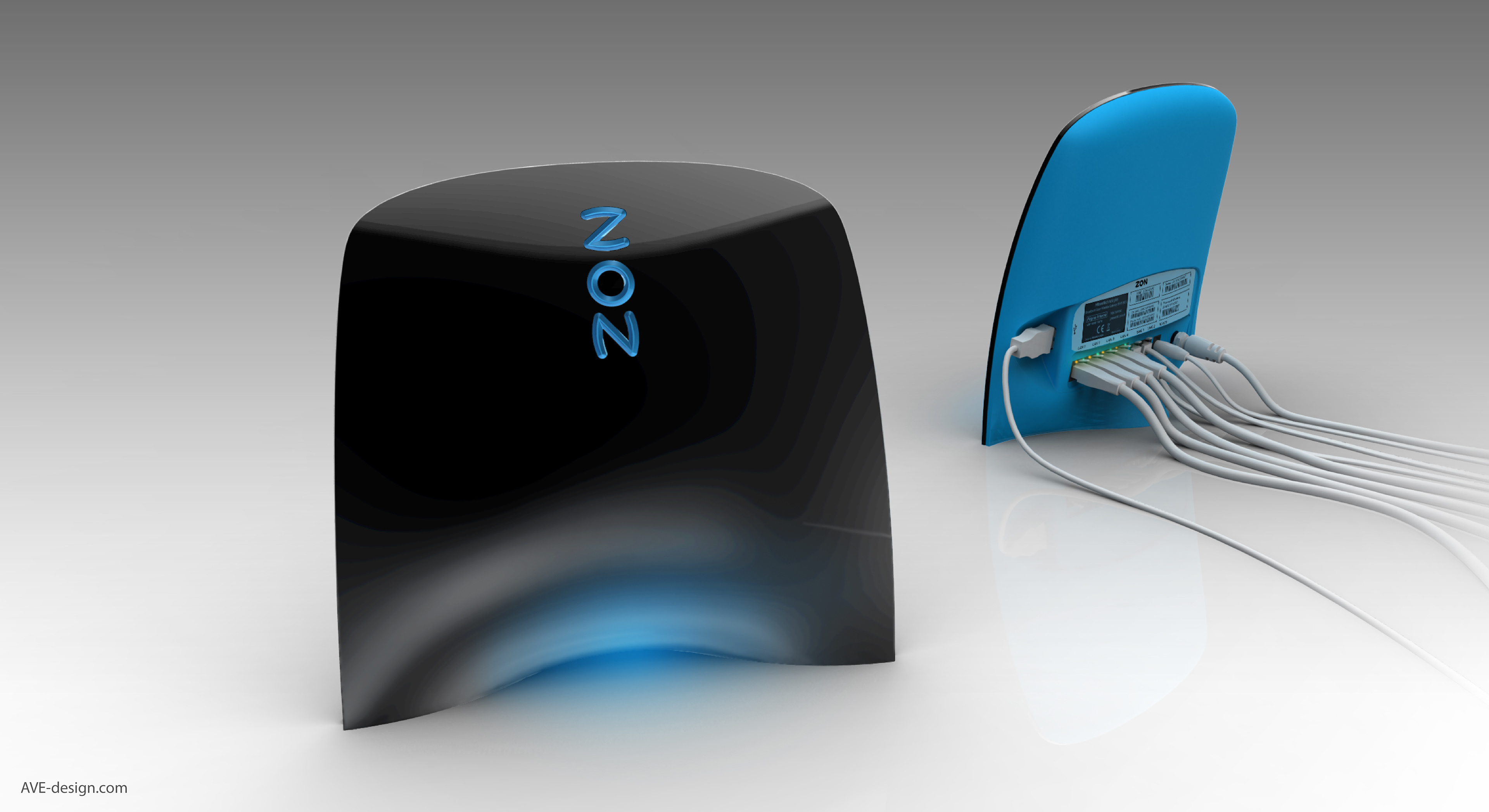
The router was deliberately designed to stand proud. It was necessary to stand it upright and make it hard to hide under a shelve or cabinet.
The ambient light in the cavity and the 3D embossed coloured logo were advanced design features.
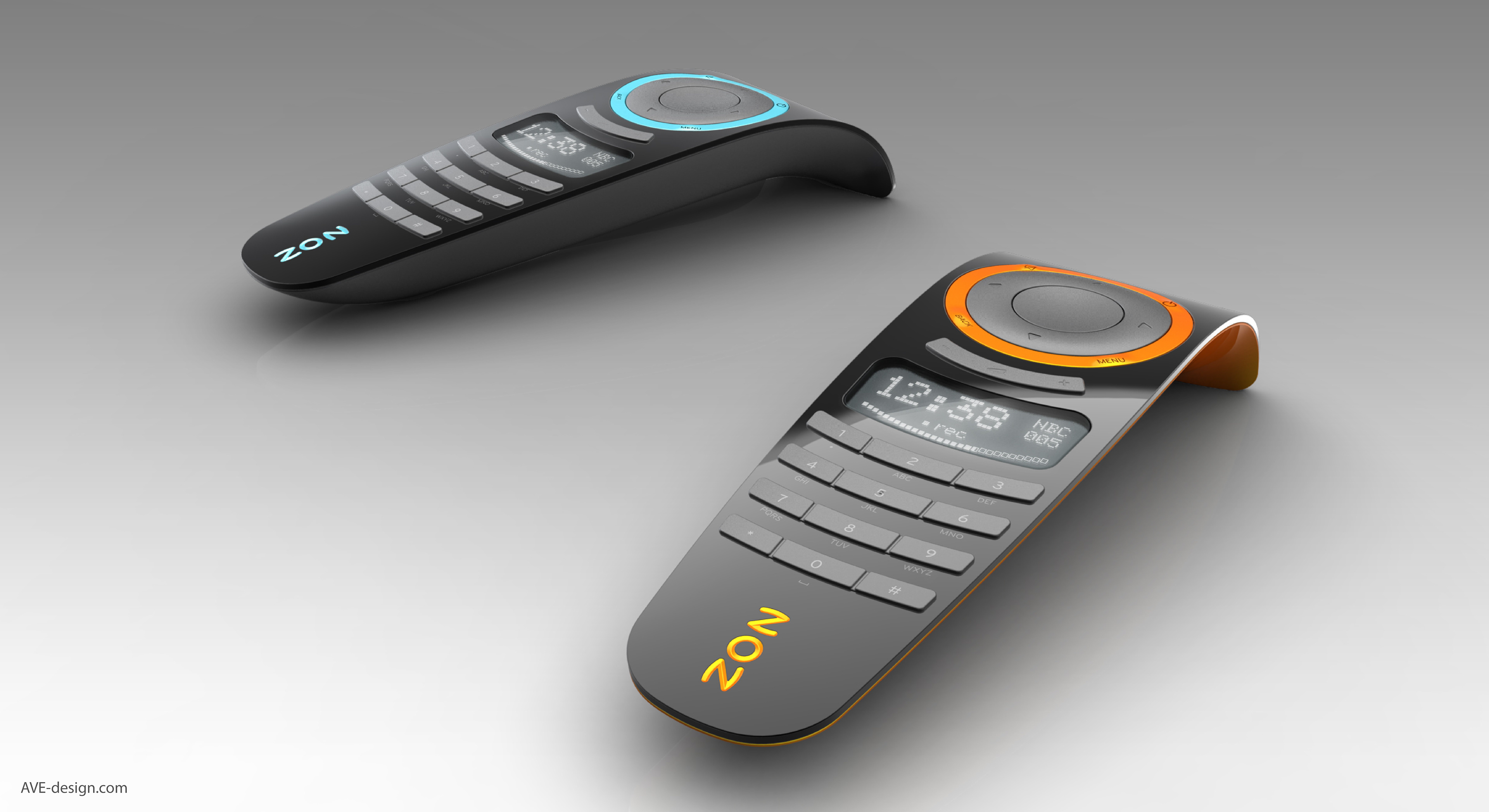
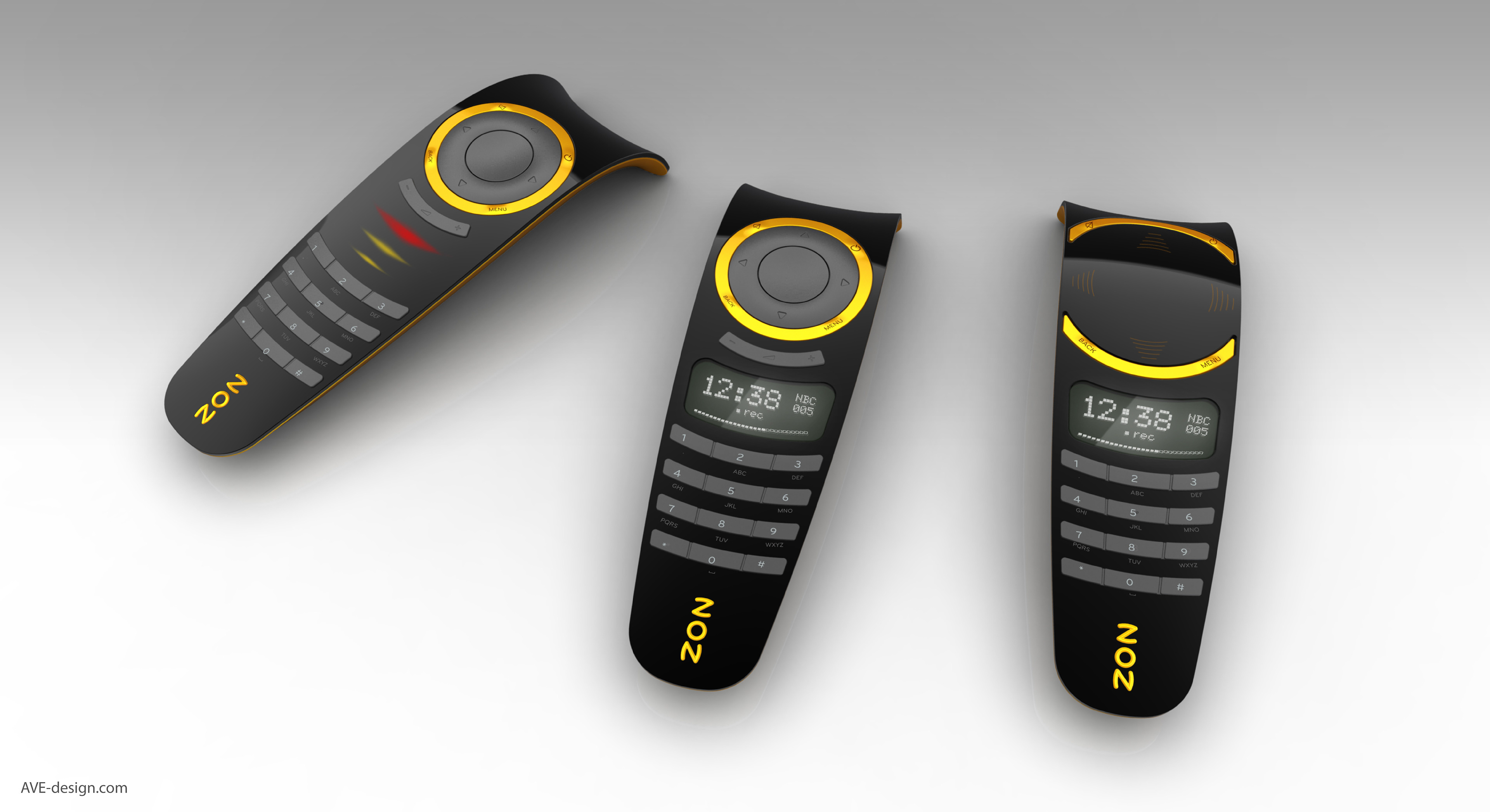
REMOTE
Variations on the remote using different technologies. It was not clear yet how advanced the remote controls were going to be.
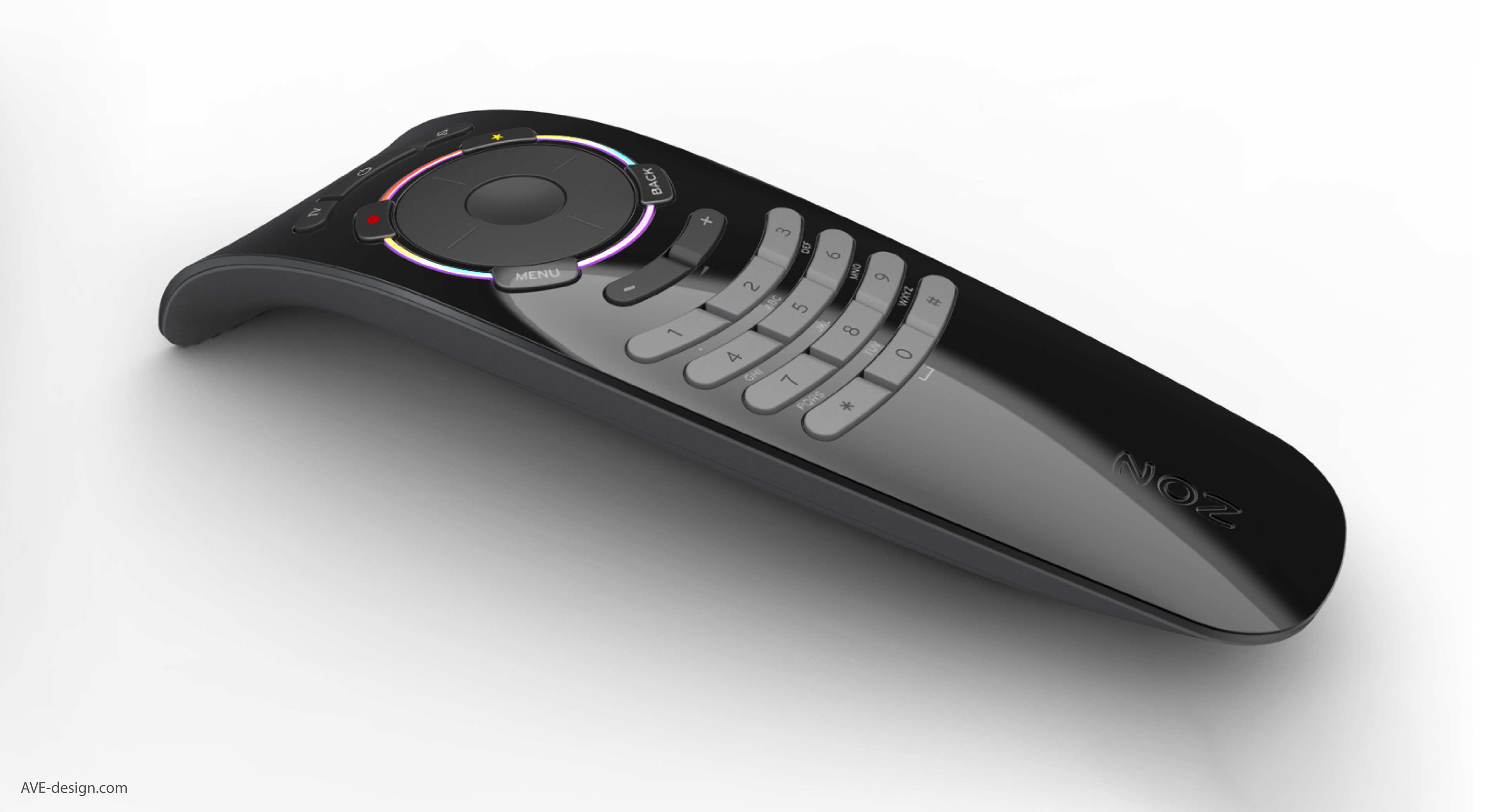
Final Design
Lots of little details made the remote special. Buttons that peeled from the inside out or the raised centre row were not noticed at first glance but just added that little bit. The overall shape allowed to remote to lay on any surface with an semantic invitation to pick it up.